Content tab
Content is viewed, edited, created and organized from the "Content" tab in Dynamic Content.
The content library windowLink copied!
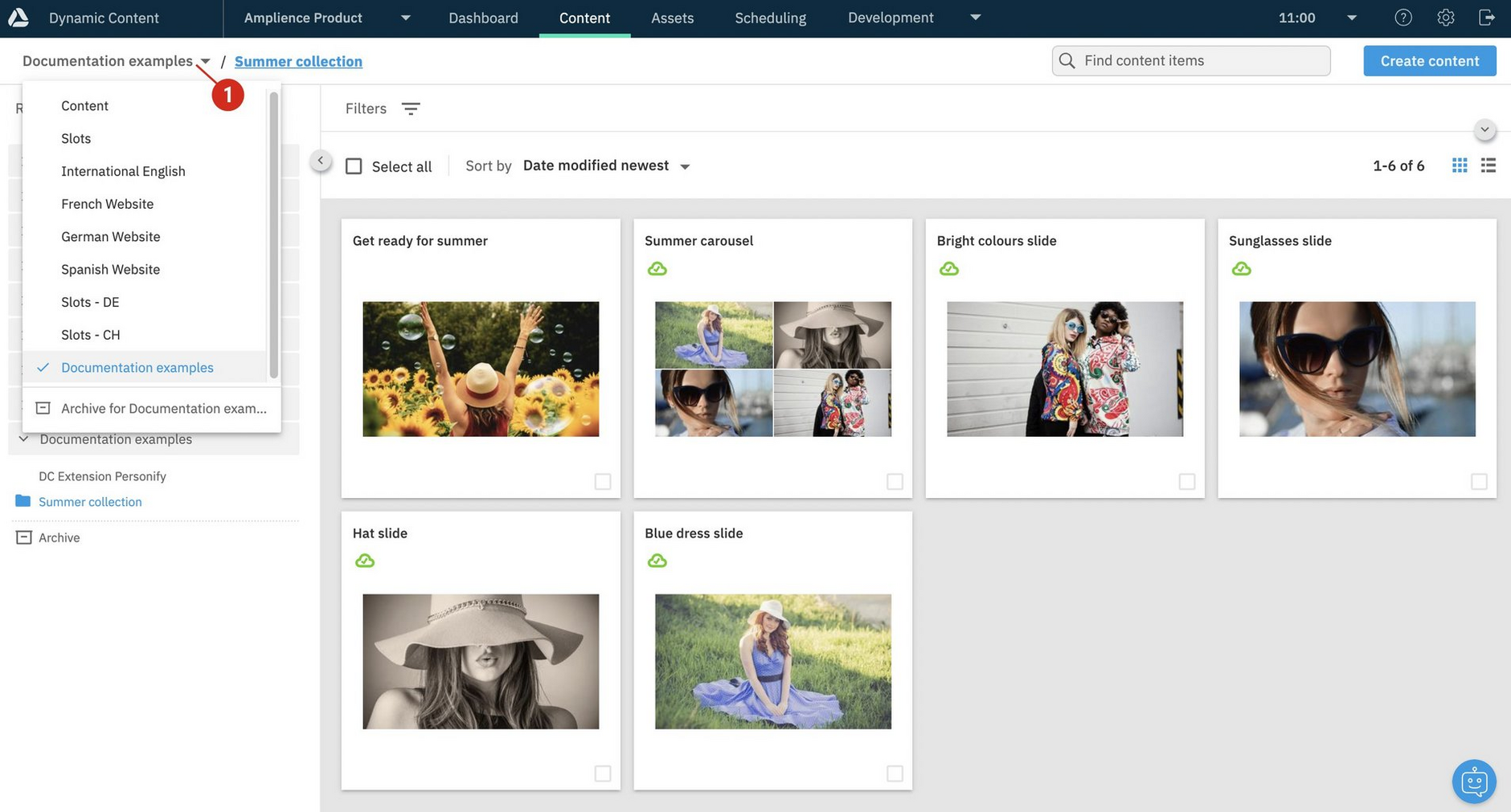
The content library window is where you work with content and a list of the repositories available to you is displayed in the left pane. In the example below repositories exist for content created in English, French, German and Spanish, as well as repositories containing slots. If you're a content producer, you'll usually be working in the content repositories and may only have read only access to the ones containing slots.
If you're working on several projects, you'll probably have access to more than one content repository, each containing its own content and allowing you to create particular types of content.
You can switch between repositories using the breadcrumb menu (1 in the image below). The content library shows the contents of the selected repository and if you have content organized into folders, will show the contents of the selected folder.
The breadcrumb also shows the folder structure, so you can see exactly which folder you're in and easily switch between them. In the image below the folder called "Summer collection" is selected and you can see that it's in the "Documentation examples" repository. This example shows the "Summer collection" folder selected in the "Documentation examples" repository.
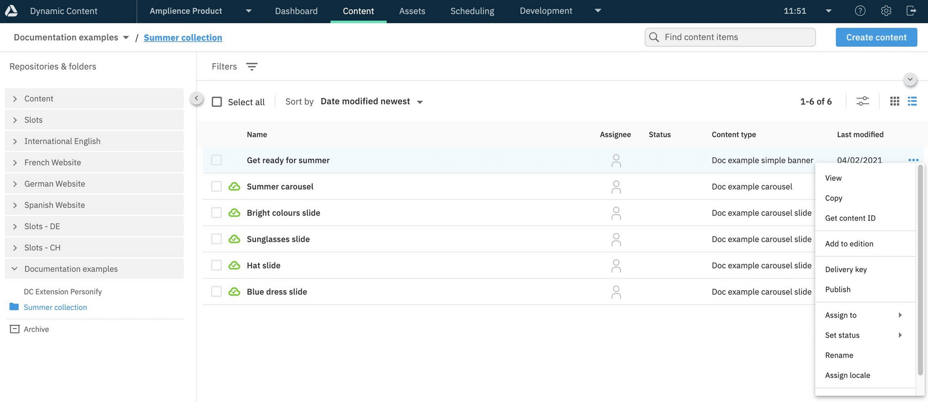
To open content for editing, double-click anywhere within it in the list. Alternatively, choose "View" from the contextual menu, either by right-clicking the item or hovering over the item and clicking the ellipsis (...).
List and grid viewLink copied!
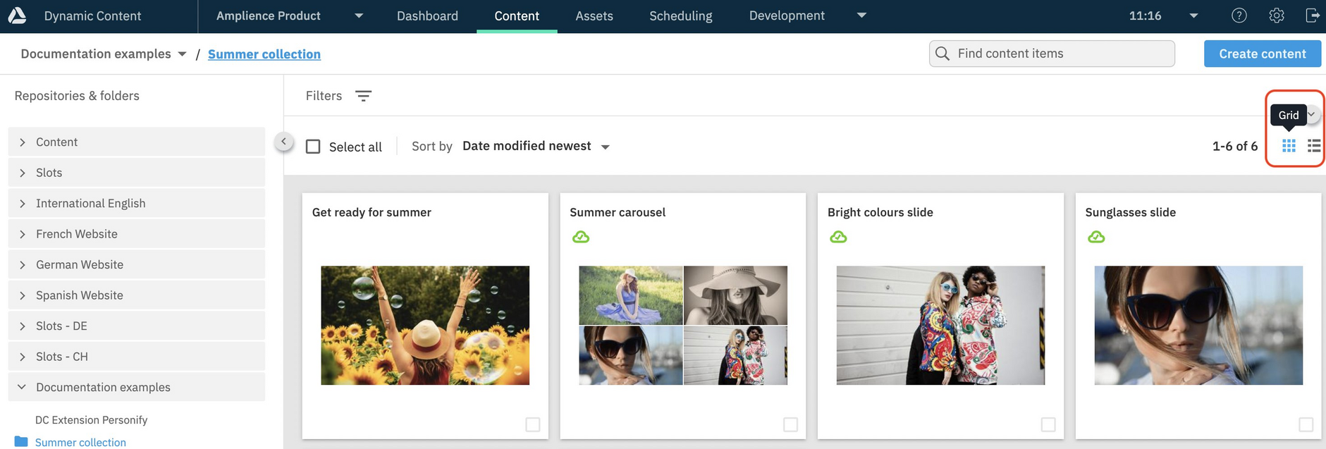
You can switch how content is displayed in the library by clicking the "Grid" and "List" icons.
In grid view, content is represented by library cards that show a preview of the content.
Note
If card previews are not displayed when you open the content library, you might need to check your settings. See Card preview prerequisites.
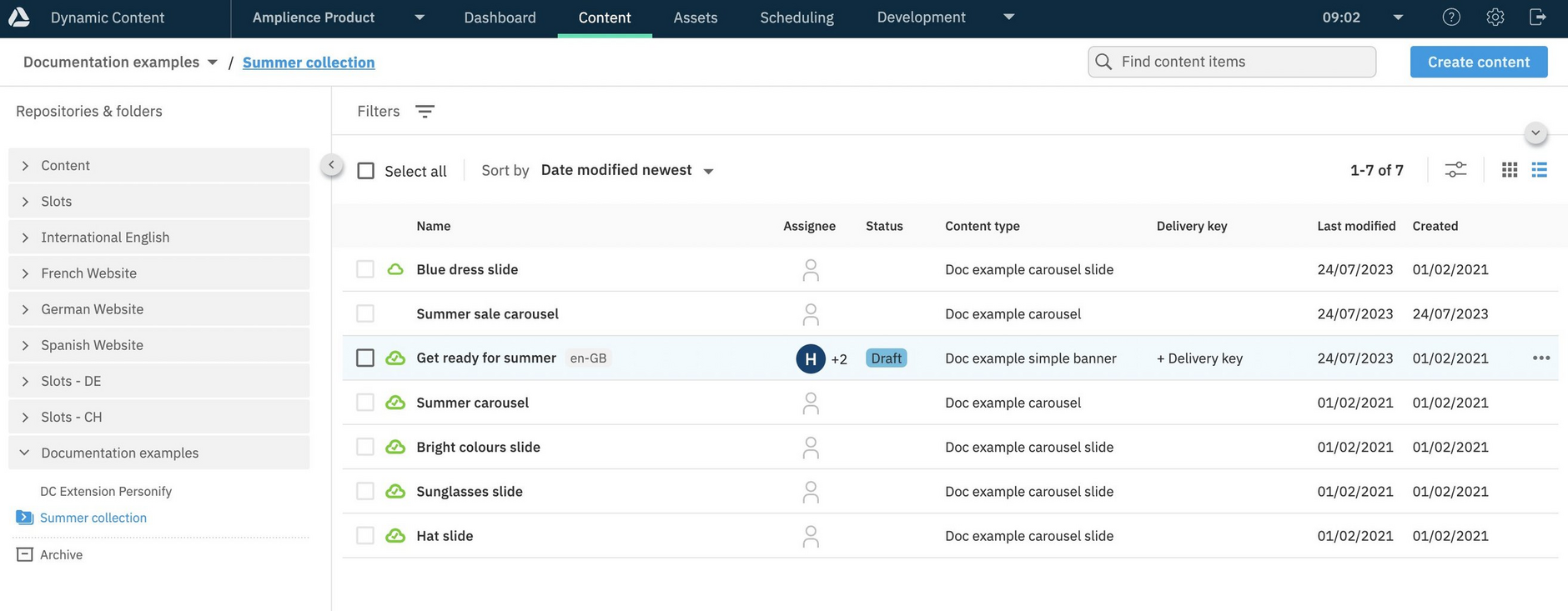
List view allows you view additional details about content, for example, content type and delivery keys.
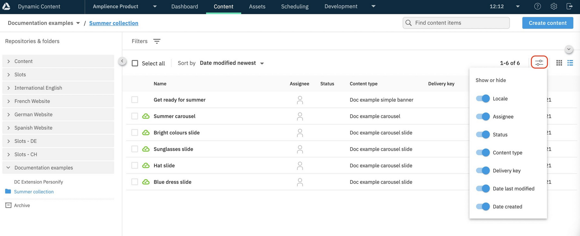
You can choose which content details are shown in the library, using the list and grid display settings.
In list view, the display settings show and hide details, such as, locale, content type and date created. In addition, you can also choose whether or not to include hierarchy child nodes in the list.
In grid view, the display setting simply allows you to show or hide hierarchy child nodes.
Note
Card preview prerequisitesLink copied!
If you see an error message rather than a card preview for items in the content library, you may need to check your setup and contact your administrator:
- You must have a virtual staging environment specified in your settings in order to show previews for any content.
- The current user's IP address must be in the whitelist of approved IP addresses in order for the card preview to be displayed
Content contextual menuLink copied!
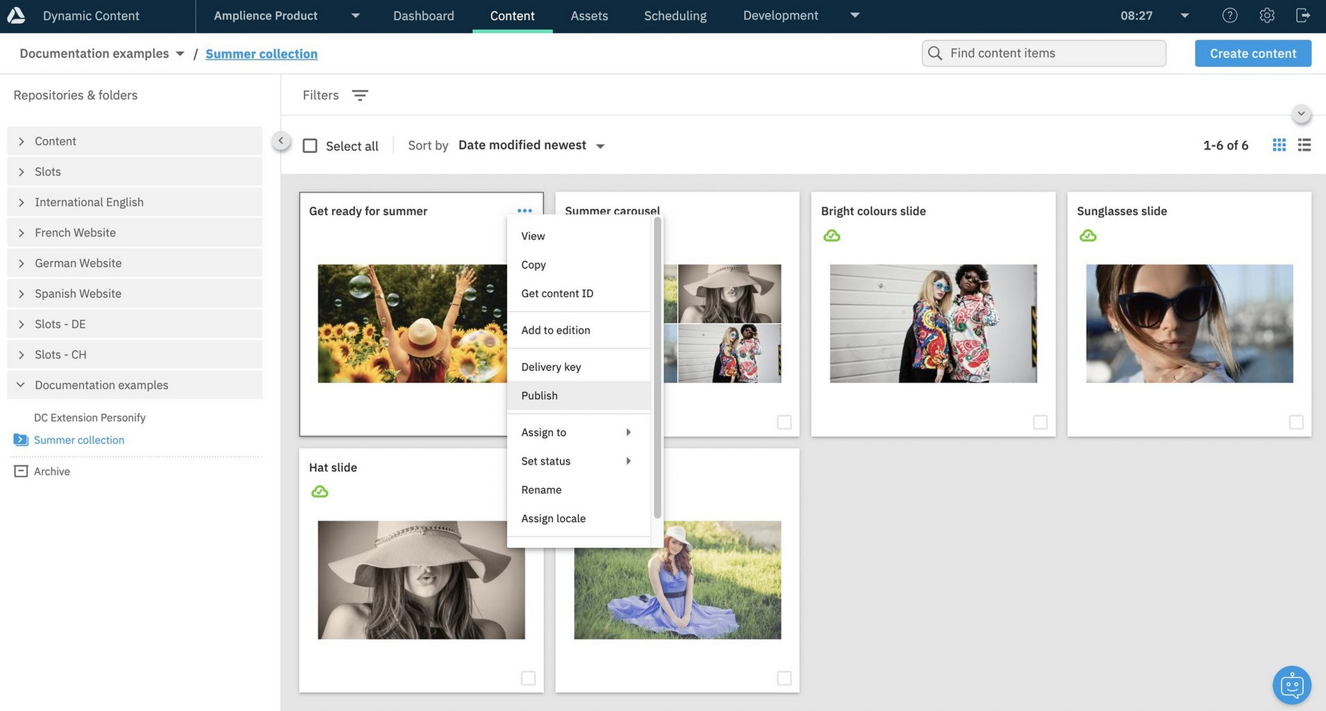
To manage content from the content library, open its contextual menu, by hovering over an item and right-clicking, or clicking the ellipsis (…).
The actions available from the contextual menu depend on how your system is configured, and can include:
-
View - Opens content for editing.
-
Copy - Creates a copy of the content and adds it to the content library with the name you've chosen. See Copying content.
-
Get content id - Shows the unique id that is used by developers to retrieve the content.
-
Add to edition - A shortcut for adding the content to an existing event.
-
Delivery key - Lets you add a delivery key, to content. This menu item is only shown if you have Content Delivery 2 enabled on your hub.
-
Publish - Publishes the content and any linked content items. See Publishing content.
-
Assign to - Lets you assign the content to one or more users.
-
Set status - Lets you set a status to the content. This menu item is only shown if statuses are set up on the hub.
-
Rename Allows you to give the content a new name. See Saving content.
-
Assign locale. If locales have been added to your hub, you can assign the content to a locale. Once you have assigned a locale you will be able to localize the content and the menu item name will change to "localize".
-
Archive - Moves the content item to the archive folder in the current repository. See Archiving and unarchiving content.
Content iconsLink copied!
In the content library, icons give you a quick way to view content details, including the publish status, locale, workflow status and assignee.
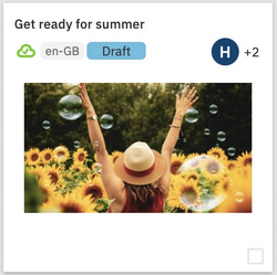
In grid view, icons are displayed on the content's card. In this example, the item is published, has been assigned a locale of "en-GB", has a "Draft" workflow status and is assigned to multiple users.
Custom locale labels
You can specify your own custom locale labels, so they are easier for users to understand. For example, for the en-GB locale code you may prefer to use a product name. See Locales.
The same information is also shown in the list view.
Search, filter and sortLink copied!
Dynamic Content allows you to refine your content searches with the help of parameters and wildcards, making it easier to find exactly what you're looking for.
Find out more about using the Search feature.
FilteringLink copied!
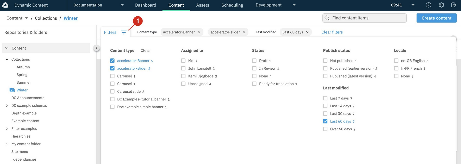
You can filter which content is displayed in the content library by selecting facets, including: content type, publish status, modification date, assignee, locale and status. Filters are accessed by clicking the filter icon at the top of the content library window, list or grid view.
The content types section lists the content types for the content in the currently selected folder, and the number of content items for each. The other filters will also reflect the content in the selected folder.
In this example we've set up a filter for banners and sliders modified in the last 60 days and the active filters are shown at the top of the window.
Clicking "Clear filters" (1) will remove the content library filters.
Sorting contentLink copied!
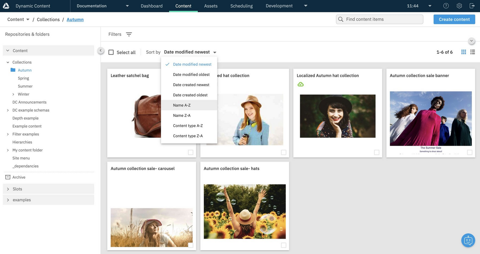
You can change the way that content items are sorted by choosing an option from the sort menu. Currently content can be sorted in ascending and descending order by modification and creation dates, content name and content type. By default content is sorted by modification date, with the most recently updated items shown first.
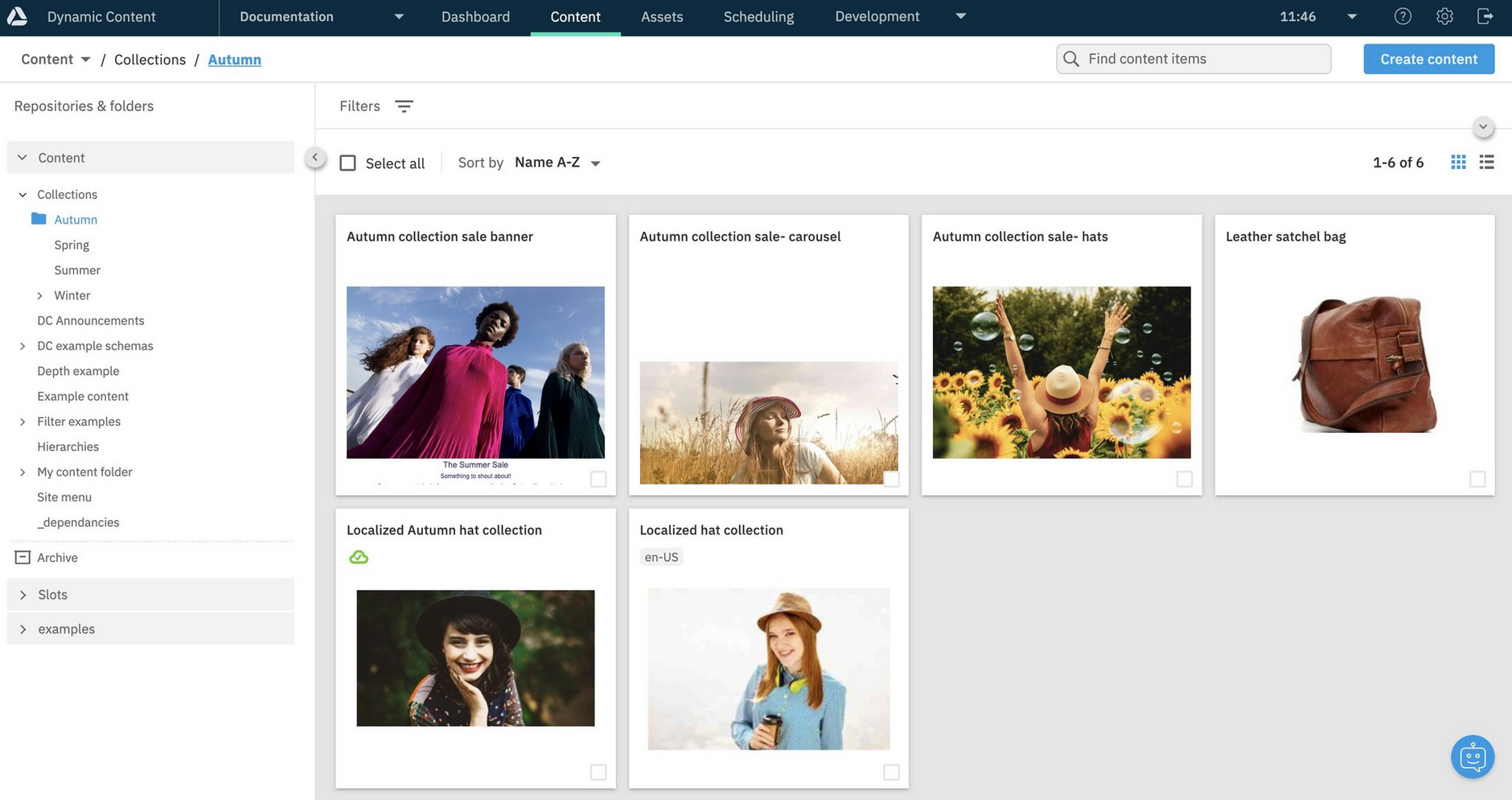
In the example below, we've chosen to sort content items in ascending order alphabetically.
The content library is refreshed, now showing the content items sorted in ascending alphabetical order by name.
Performing bulk actionsLink copied!
Dynamic Content bulk actions are provided so you can perform tasks, such as, archiving items, setting statuses and assigning locales, for up to 20 items at a time.
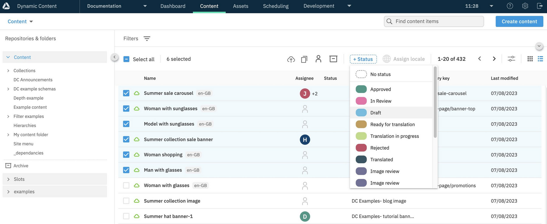
To use bulk actions, select items in the content library, optionally using the "Select all" option. When items are selected, the bulk action icons are displayed in the toolbar. Choose an action from the toolbar, or the right-click menu, and follow the on screen instructions. If you switch between list and grid view, your selection is retained.
Here's an example of setting the status for selected items using "Bulk set status":
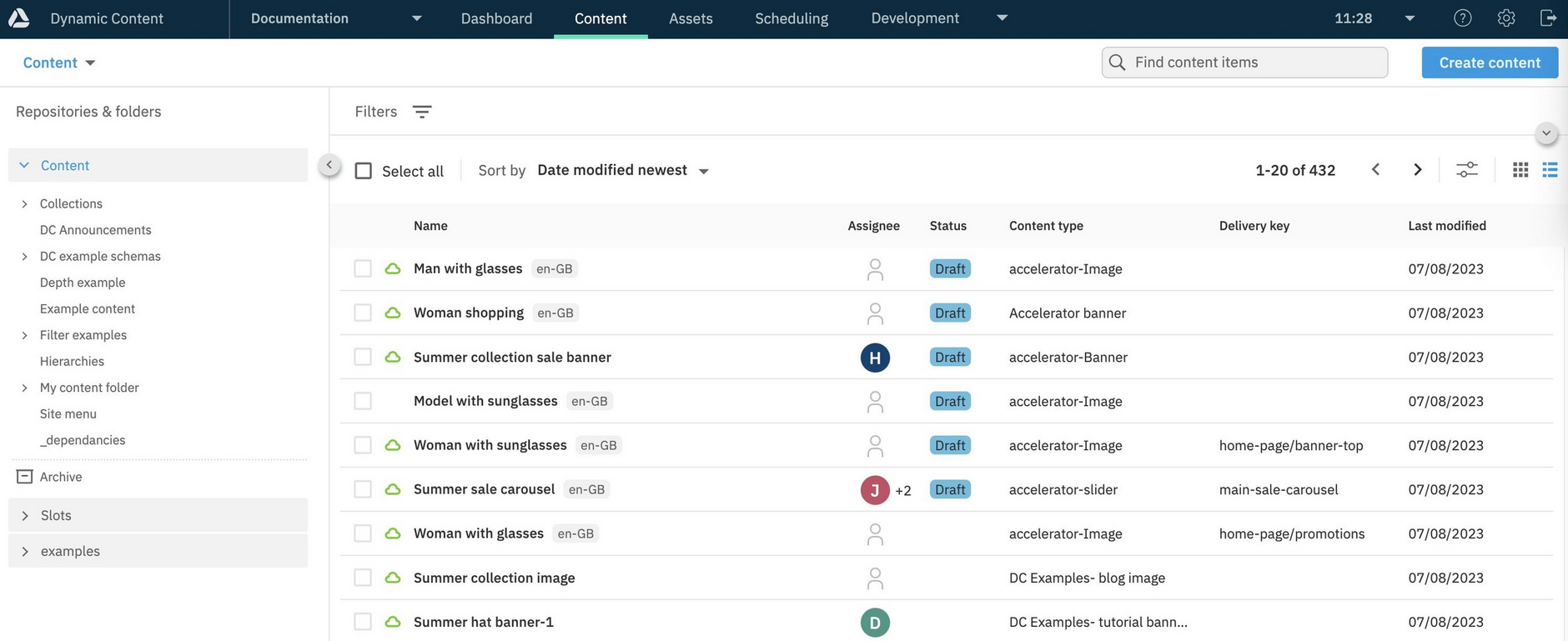
The content library is updated to show the status that has been set for the items.
Managing foldersLink copied!
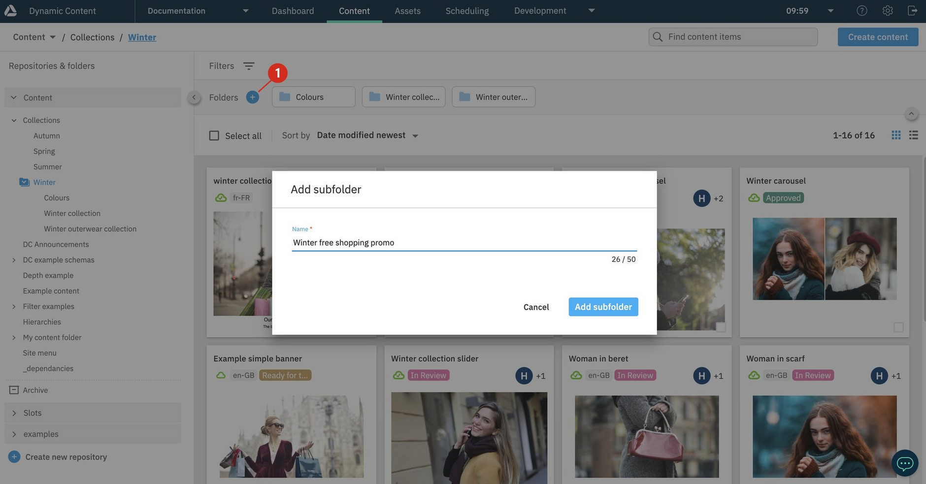
To create a new folder click the "+" icon (1 in the image below) to create a new folder at the current place in your folder structure. Alternatively, right-click on the name of the folder in which you want to create subfolder.
In the example below, a folder will be created in the "Winter" folder.
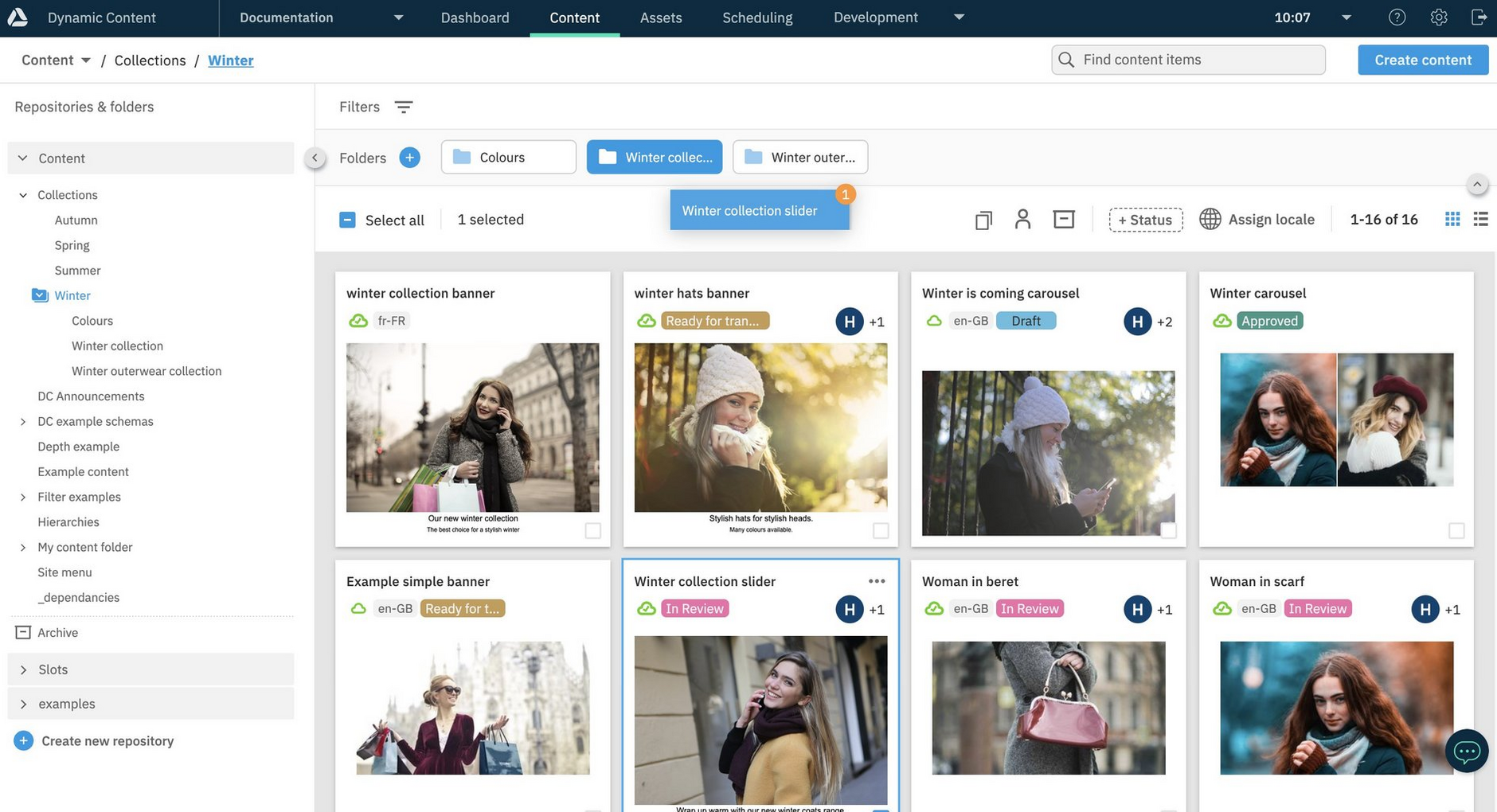
Moving content items between folders is easy. Just select the content you want to move and drag it to the destination folder. In the example below we're moving the "Winter collection slider" item to the "Winter" folder. You've always been able to move content between folders, but now it's a lot more convenient.
It's also possible to move folders into other folders, so you can easily change your folder structure.
You can find more details of folders on the Organizing content page.
Hiding the left panelLink copied!
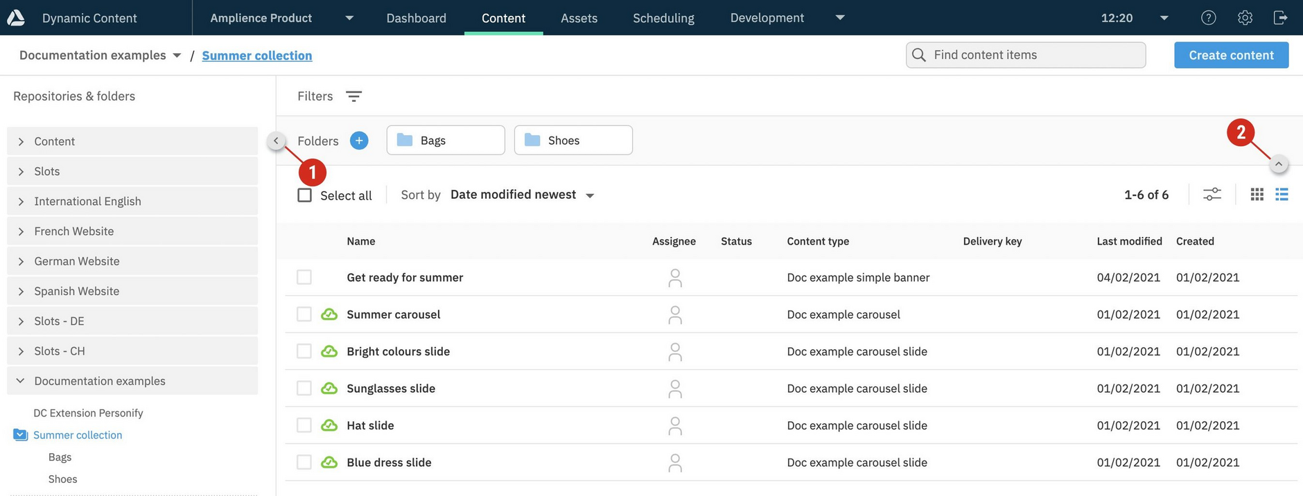
To create more space for focusing on your content, hide the left panel by clicking the icon (1 in the image below). To collapse the folder navigation click the folder view icon (2).
The content authoring experienceLink copied!
Dynamic Content provides a content authoring experience for you to create, view and edit content.
The fields that are displayed, depend on the item's content type. For example, the content for a blog type item may be text based, whereas a landing page type may have a collection of images. The content types available to you, are set up by your developers.
When content is opened in the authoring experience you can:
- View a visualization of how the content will look (this needs to be set up by your developers)
- Access previous revisions of the content
- Check whether the content is scheduled in editions
- View its properties, such as, the dates it was created and last edited, delivery URLs and where the content is used in other content. See content item properties.
Developer note
For an overview of how to create content types for content producers and authors to use, see Developer's Get started guide.
Content text editorsLink copied!
From the content authoring experience you can edit rich text fields with:
The default editor, which provides limited features for editing rich text/markdown format content item text fields. The Markdown tab is shown for a field only if a developer has set the text format to markdown in the content type schema. See Setting text properties in the schema.
The Generative rich text editor extension, which features embeddable content items, enhanced markdown support and a ChatGPT powered AI assistant. Note, the Generative rich text editor extension will need to be enabled on your system.
For help with common rich text formatting questions, see Creating content FAQs.
Content form extensionsLink copied!
Amplience provides extensions that enhance and enrich the process of adding content with Dynamic Content. For example, there are extensions to help with image transformation, translation and applying your brand colors. For more example extensions, see Content field extensions.
Adding extensions to the authoring experience
Extensions must be set up by your developers. See Registering and using extensions.
In addition to the extensions provided by Amplience, your developers can create extensions that are specific to your own use cases. See Extensions.
